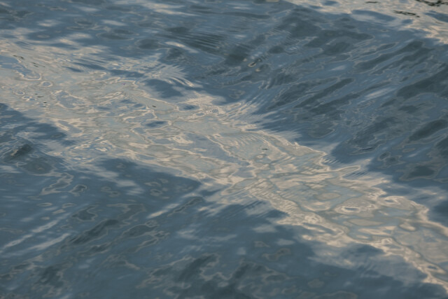
Pastel Blue
In contrast to my blip from 3 days ago where the water had a shiny metallic feel to it, today the waves were a pastel blue, almost as if they had been drawn.
There's that association again which I dislike. Why? Because I think of such a photo as a representation in its own right and a comparison somehow elevates the other arts above photography, which I don't think is the case.
How might I better describe it? Perhaps it's a lack of fine detail so that shapes become more evident, amalgamated, stylised.
In any case, I found any attempt to add contrast interfered with the soft pastel colours and took away from the effect. So, unusually the image is almost unedited save for a little brightening.
Incidentally, a while back I had switched to raw only rather than raw+jpg, since I never use the jpg and the space they occupy accumulates. But, I didn't realise a consequence was I cannot now select different aspect ratios in camera, which is occasionally useful. But suddenly I realised I was getting jpgs again, must have changed a setting inadvertently.
Comments
Sign in or get an account to comment.


