
Pantone Chart
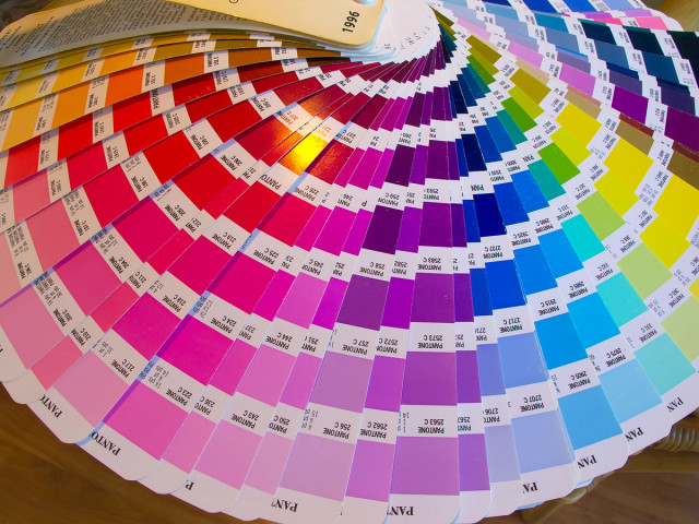
For many years I owned a graphic design and print broking business. I used charts (such as the one pictured above) all day, every day.
A lot of people don't appreciate the various revolutions that have taken place in colour printing. One of the many game changing developments (leaving aside the whole area of digital imagesetting for the moment) has been the development of smaller and faster four colour presses which in turn has led to cheaper four colour process (i.e. "full colour") printing. These days the lion's share of colour work is the process whereby cyan, magenta, yellow and black dot patterns are superimposed to create a seemingly infinite variety of "process" colours - such as might be found in a colour photograph.
Once upon a time (back when there was a living to be made with one and two colour presses) it was far cheaper (and more common) to pre-mix "solid" or "spot" colours, which could only be varied in intensity with the aid of "screens". Anyway, to cut a long story short, the range of colours it was possible to mix was worked out with the aid of a "pms" (i.e. Pantone Matching System) chart such as the one spread out above.
I won't bore you with a whole lot of technical details. I just thought the chart would make a pretty picture.
Comments
Sign in or get an account to comment.


