
Ma Murphys
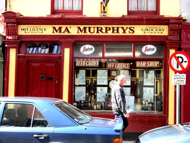
Ma Murphys is a popular pub in the main street in Bantry. It's narrow, but goes back a long way.
This is an example of really accomplished sign-writing, and it used to be even better with highlights on the red returns according to some older photos I have seen. It is curious that the apostrophe seems to have been acquired recently - it is missing in the older pictures as far as I can see. So is this a rogue apostrophe? Should it be after the Y? I have tried to discover if the 'Ma' is short for maybe Mathew, in which case it could be excused - but I will let you decide. Anyway, most punctuation is generally redundant on signs in my opinion - what does it add?
This genre of lettering has a fine tradition in Ireland and has close affinities with traditional fairground signage which uses this style to the max. Here it has poise and considerable presence - the only fault being in the O of 'Off Licence' which is a bit obese. What can't be seen in this photo is that the letters have a very subtle shadow (you may just be able to see it to the left of the R) which gives the whole sign even more depth.
The whole window is a feast of typography and illustration - the worst being the most recent 'Segafredo' monstrosity which I hate.
208
views
- 1
- 1
- Canon PowerShot S90
- 1/100
- f/4.0
- 11mm
- 160
Comments
Sign in or get an account to comment.


