Barnsley College
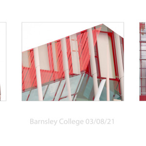
I've done seven different versions of this composite image and finally this morning I've come back to the first one I put together yesterday. I think, because of the colours and complicated lines, these will work better as a triptych or maybe simple as singe images. (Ive tried a few more composites this morning.)
It was my haircut day in Barnsley, so I got the car washed on my way and then made my way to the Courtyard car-park when I was cropped. This car-park borders both `old' and very new buildings in Barnsley. The original new buildings house some of Barnsley's voluntary organisations, but the very newest are Barnsley College buildings. As the college is now on holiday I had a wander around their campus. I think the red building houses their art school.
Anyway I was pretty tired at the end of the afternoon, it being very warm and I debated whether to simply drive home or to change my shoes and walk across to M&S for a foodie treat. In the end the food idea won and I walked across town, past the newly developed Glassworks complex with it's garden area, which looks almost finished. I think it's the first time Ive walked through Barnsley for a year - lots of people, lots unmasked! Perhaps less important in the open air (though the air was very still yesterday). Some unmasked in M&S, which I find disconcerting.
I enjoyed my duck leg yesterday and had a first look through my images. When you do multiple exposures you end up with lots - 194 in my folder, though I have created one or two duplicates. I need to put them to one side now and come back to them. Because I mainly was using a telephoto lens I've realised that a wider angle image or two would probably help to simplify the set.
p.s. lots more modern buildings to explore in Barnsley
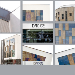
p.p.s. the extra is a selection of images from one building - a voluntary services building `The Circle' - I think. A mix of single and multiple images. I wanted to see the effect when I controlled the colours - in many ways I prefer this one.
I've just had a try with a triptych which I think simplifies the overall impact. Maybe the middle one should be b&w - I've got lots of red ones to try.


Comments
Sign in or get an account to comment.


