A tribute
This image is a copy of an original which you may recognise (depending on your age and, perhaps, musical tastes). The original was created by Storm Thorgeson. Thorgeson, of Norwegian descent, was born in the town where I now live, and became a very successful graphic designer, photographer and music video director. This particular image was created for the cover of Pink Floyd's 1994 album "The Division Bell". He worked with the band over many years, and his creations included the famous floating inflatable pig over Battersea power station in London.
My tribute version of the photograph was taken at the Pink Floyd exhibition, currently on at the Victoria and Albert Museum in South Kensington. This is a brilliant and very entertaining exhibition, extremely well designed and put together, and very enjoyable - even if you're not a particular fan of this band. These giant heads were on show in the exhibition, with a backdrop representing the original scene, where Lincoln Cathedral could be seen on the horizon between the heads.
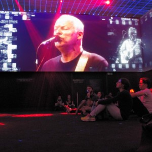
Some time ago we visited the David Bowie exhibition at the V&A and had to rush round as it was far larger than we realised and we were in danger of not seeing it all before we were thrown out when the museum closed. We have learned from that, and we visited the current exhibition much earlier in the day, giving ourselves plenty of time to examine all the displays, watch the videos and listen to the music. (We were there for about four hours in all!) It was interesting to understand how their musical ideas developed over the years, to see how they embraced and encouraged technological advances in sound and light manipulation and how they created huge spectacular shows which have formed the basis of many modern popular music performances. Even the final part of the exhibition, projected videos of live performances, was quite a technical achievement, with multiple projectors creating images on all four walls of the room, moving lights and glitter balls, and multi-dimensional sound (see the Extra).
Highly recommended.
Our visit coincided with the public opening of the new exhibition space and entrance from Exhibition Road. The entrance, into The Sackler Courtyard, did not wow me, I'm afraid. Although impressive with the porcelain tiled floor, I was disappointed that the raised central area (presumable designed to allow sufficient height for the new Sainsbury gallery below) and the café building on one side actually hid some of the original glorious Grade 1 listed building. However the new space inside the building (including the Sainsbury gallery) is impressive and a valuable addition to the museum.


Comments
Sign in or get an account to comment.


