And in the Green Corner
Just plodding away today ... next basket case. Weather so disappointing after a taste of summer yesterday :-(
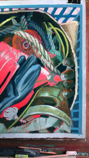
Trying a red underpainting for this predominantly green pastel work.
By using the complementary colour to green (red) it is said that the finished work will be brigher... more vibrant... that's the theory.
Don't half hurt the eyes though :-(
I did it partly to avoid those teeny white sparkly bits that don't want to be covered when pastelling - those teeny dimples in the paper that hide from the pigment - I find them distracting... so I guess this time I'll have red dimples :-(
143
views
- 11
- 1
- Sony D6603
- 1/125
- f/2.0
- 5mm
- 64
Comments
Sign in or get an account to comment.


