Mono Monday : : Angles
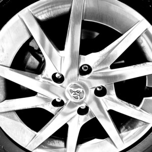
It's funny, there are angles everywhere, so I thought this challenge would be a slam/dunk, but I found a lot of my pictures of angles were just boring. As I wandered around town today randomly taking pictures that had lots of angles in them, I learned some things about what I perceive as interesting, even striking, as opposed to what I perceive as beautiful. I took pictures of the ceiling, perforated by skylights at the mall, curious looking grates and manhole covers in the street and numerous buildings, which, almost by definition have to have straight lines and lots of angles .(Never mind what people must have thought about a lady of a certain age, kneeling on the ground in the parking lot taking a close up of a hub cap.)
Nature does not contain straight lines, and I think I am inclined to think of shots taken from nature as beautiful. But I am urban enough to expect a building to set itself aside from nature and be straight and well grounded. Buildings can be abstract, but buildings like Frank Gehry's famous Guggenheim Museum in Bilbao, or, worse yet, the Dancing House in Prague, make me crazy. Buildings can be beautiful...they should also be solid, protective, and interesting.Call me a traditionalist, but they should not dance! Moldings, decorations, even ceilings can curve, but please, not the walls….
My shot is a section of the new Boudin Bakery building in Santa Rosa turned at a 45 degree angle. I couldn't resist putting the hubcap--rounded angles within a circle--in the extras.
Thanks to JDO for hosting the challenge and for coming up with such deceptively simple sounding topics.


Comments
Sign in or get an account to comment.


